CBA Logos: Ranked.
researched and reported by C.C. McCandless
The CBA Slack board has seen the occasional discussion of the quality and appeal of various clubs’ logos. To that end, I surveyed a hand targeted focus group to answer this question: my two kids. They evaluated each logo on a 1-5 scale and were free to add any comments of their own. Our panel consists of A.J., a sports-crazed ten year old boy; and Courtney, a seven year old girl with authoritative opinions on animals, pictures, and the general coolness of anything.
Without further ado, on to the rankings:

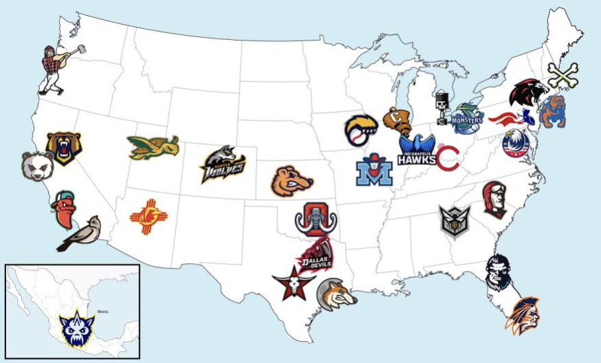
30th. Carolina Aces, 2.75.
Unfortunately, this one wasn’t too eye-catching to the younger demographic.
29th. Los Angeles Chilis, 3.00.
“Because I hate chilis,” she explained of her low mark.

28th. Miami Warriors, 3.25.


25th. Atlanta Swarm, Austin Outlaws, & Oklahoma Mammoths, 3.50.
Our first of many ties in the rankings. “It fits with the Texas theme,” he said of Austin. “I like Ice Age and there’s a mammoth in it,” she said of her score for Oklahoma.


19th. Dallas Devils (“It looks scary”), Cincinnati Royals (“It starts with a ‘C’ like my name”), Detroit Motors (“I like tat name for Detroit”), Iowa Predators (highly rated by her for being a cat), Midwest Plainsmen, Philadelphia Liberty (“I love the word ‘liberty’ because it’s cool to say”), 3.75.


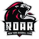
15th. Chicago Gale, Florida Giants (“cool logo” and “we like Florida because of Disney World”), Mexico City Chupacabras (“It’s a little scary but cute”), New York Roar, 4.00.


13th. Bay Area Pandas (“It’s cute and it sounds like a good team”), Portland Axemen (“Because it’s a funny name”), 4.25.
12th-3rd sees a massive logjam of teams all highly rated at 4.50.
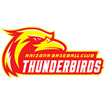
Arizona Thunderbirds: “Nice colors, really nice logo.”

Brooklyn Bulldogs: “I like dogs and I have a friend named Brooklyn.”
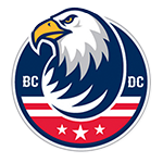
DC Eagles: “Fitting for Washington DC.”
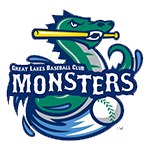
Great Lakes Monsters: “It’s Slimey!” she exclaimed, comparing him to a favorite character from a new videogame.”

Houston Moondogs: “So cute, so cute!”

Indianapolis Hawks: “That’s Maui!” she announced, due to the resemblance to Dwayne “The Rock” Johnson’s shape-shifting avian form in Moana.

Sacramento Golden Bears: another “so cute.”

Salt Lake City Snappers: “It’s perfect for Salt Lake City,” he said. “I love turtles,” she added.

San Diego Skylarks: “So cute so cute!”

Wichita Weasels: “Very funny. That is actually one of the coolest ones.”
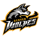
*2nd. Denver Wolves, 4.75. “I want to do higher than five,” she said. ”It’s a cool logo but not totally perfect,” he added.

1st. The only club to receive a perfect score of 5.00 was the BOSTON ROGERS. “It’s lit. It’s just so good,” he gushed. “We cheer for Boston,” she added accurately, with the CBA being the lone exception.
And there you have it. Branding appeal to the youth demographic will obviously be a concern for the viability of the CBA in the post-MLB sports world, and these results show that the fledgling league is off to an incredibly promising start in that department.
* – She was not allowed to give a rating higher than five. However, there may have been bias for the Wolves selection due to them being the logo for the researcher’s team. Thankfully, the boy seemingly did not let this get to him too much as evidenced by a less than perfect rating.